Colors have the power to influence our thoughts, emotions, and actions. In web design, colors can imprint your page in the minds of your visitors. Here’s a fun fact – Color influences 85% of shoppers’ purchase decisions.
Think about this: Would you be excited to shop on a website with dull colors that do not communicate the brand’s niche? Perhaps no! But, if you see a website with a burst of happy colors, you would probably be excited to explore more. Moreover, colors can create an emotional connection between your website visitors and your brand.
Irrespective of the kind of brand you are designing a website for, the right tone of colors can help effectively narrate the brand’s story and establish a personal connection with the audience. Without any further ado, let’s explore the world of color psychology and discover how to create a website that wows website visitors!
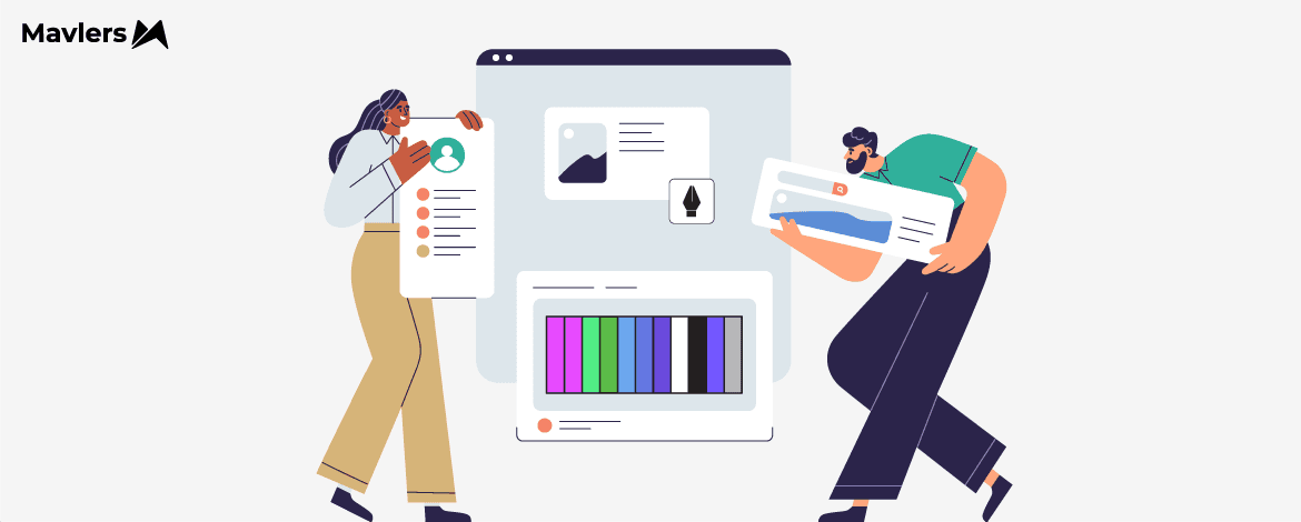
The Relevance of Colors in web designing
Here are a few reasons why colors are essential to website design.
. Build a brand identity
Colors hold tremendous potential to create a unique identity for a brand. Persistent use of a particular color across your page will eventually lead to visitors holding that shade synonymous with your brand.
. Tap into emotions with web accessibility
Colors can successfully help make your website more accessible. Using the right color contrasts can make reading and navigating your website more accessible for all kinds of visitors.
. Create an excellent first impression
Colors alone can influence up to 90% of an initial impression!
We cannot lay enough emphasis on how important a first impression is. Since colors are the first element that website users notice when they land on your website, the color scheme needs to be on point and in alignment with your brand.
An aesthetically pleasing color palette can help you create a positive first impression and entice your visitors to stay longer, increasing your website’s overall dwell time.
. Bond with your visitors by evoking emotions
Sometimes colors can express what words can’t! They can evoke different emotions and feelings within an individual.
For instance, colors with a warm tone instantly make your users feel welcomed and give them a sense of comfort.
. Guide your users through colors
Colors can guide your users through your website’s content and create a sense of hierarchy. For instance – using bold and contrasting colors for CTA buttons can make them stand out and push users to take action.
Most popularly used colors and a few examples for inspiration
Now that you know the importance of colors on your website, let’s learn about a few colors that are the most famous among brands. Additionally, we have included some compelling examples to help you design your upcoming website.
. Red
Red is bold and often associated with feelings like passion, excitement, and energy. It can create a sense of urgency to draw attention to a specific element on the webpage, like CTA.
However, you must exercise caution while using red and be aware of its undertones. Warmer and brighter shades of red carry entirely different connotations. Thus, before choosing one, ensure it aligns with your brand image.
Take the famous beverage brand Coca Cola for example. Notice how the red background, logo, and overall hues of red evoke a sense of excitement.
. Blue
Blue is a color often associated with trust, reliability, and professionalism. It can be used to create a sense of stability and security.
This is precisely why brands catering to online prescriptions, data aggregating, or a similar niche use blue as their primary color.
Take the mega-giant Facebook as an example. The brand uses blue as its primary color to subliminally communicate to its users that it is a trustworthy platform.
. Pink
Pink is a fun color that evokes a feeling of innocence and romance.
However, here too, you need to keep the undertones in mind. While bright and hot pinks are associated with love and romance, intense pinks can create a sense of urgency.
Here’s how Victoria’s Secret Beauty uses pink to highlight its products. They have maintained pink as their primary color across the website to give a feminine touch.
. Green
Green signifies tranquility, nature, organic, and peace. It offers website visitors a feeling of rejuvenation, calmness, and relaxation.
If you are a brand in the organic or environment-friendly space, then you need green to be your website’s predominant color.
Here’s how Easy Greens celebrates the color green on its website to represent fresh and organic groceries.
. Yellow
Like sunshine, yellow is a bright and cheerful color often associated with happiness, joy, and optimism. It can evoke feelings of positivity and excitement within your website visitors. This color is supremely versatile and is used by most brands, from kidswear to toys.
It also symbolizes wisdom and curiosity, which is why it is used by websites that want to depict intelligence and authority.
See how the innovative weather app Cats & Dogs has added a striking yellow background to uplift the overall mood and presence of the website.
. Black
Black reflects power and sophistication, which is why luxury brands popularly use it.
Look at how the super luxury brand Chanel uses black with a minimalistic design to convey luxury and elegance.
. Orange
Orange is a vibrant, energetic color popularly used by brands associated with technology.
Many websites can use orange in their CTA buttons as it evokes a sense of warmth. The color is also used in ads to lure the attention of users.
Take the gummy brand Boost as an example. The brand has cleverly showcased how Vitamin C gummies extracted from the fruit Orange can be consumed to keep diseases at bay! They have showcased this by keeping Orange as the website’s primary color.
Calling It A Wrap!
When armed with the knowledge of color psychology, you can create websites that look great and at the same time connect with your users on a more profound and personal level. Color psychology is not an exact science, and colors can have different meanings depending on your brand’s context. The idea here is to think out of the box and create a palette that reflects your brand’s message! So get going, experiment, and create a website that is a feast for the eyes and the soul.
Are you in search of web design support? Our team of skilled UI/UX designers is ready to provide assistance tailored to your needs.