Designing a good user interface (UI) and user experience (UX) is an art and science. It takes research, trial, and success to get it right. How much you should add to a given interface is always up for debate. Some designers say less is more, while others argue that the opposite is true. In our fast-paced world, with many consumer products at our fingertips, it’s easy to feel like you’re suffocating in a continuous well of information. So, in this article, let us understand why we are rooting for a “less is more” design approach to UI/UX.
What is the Difference Between Functional and Aesthetic Design?
One of the primary dilemmas that grip designers while developing UIs and UXs is whether they should take the aesthetic or functional route. Wondering what’s the difference between these two approaches? Let’s take a closer look:
Aesthetic Design
The primary goal of aesthetic design is to make the user interface (UI) visually appealing. This involves choosing an attractive color scheme, using stylish fonts, and adding other visual elements to please the eye. Aesthetics are important because they can influence a user’s first impression of your product. If your product looks good, users will be likelier to try it.
Functional Design
Functional design is all about ensuring the UI is easy to use and navigate. This includes designing intuitive controls, laying out information in an easy-to-understand way, and providing helpful tooltips or error messages when needed. The functional design ensures that users can use your product and achieve their goals. Even if your product looks good, users won’t stick around if it’s not easy to use.
Aesthetics and function are critical aspects of UI/UX design, so it’s ideal if your design philosophy incorporates both.
The Importance of Designing with Humans in Mind
Designing with humans in mind is important for a number of reasons
- It helps to ensure that the products we design are easy to use and understand.
- It helps us create products that are appealing and visually appealing to users.
- Designing with humans in mind helps us create products that are more likely to be used and adopted by users.
So, how can you design something that’s so visually attractive that it makes you want to click and also so great to use that it makes you want to experience the same again? To understand this, we need to acquaint ourselves with “Flow.”
Flow: UI/UX Designing’s Fundamental Element
Flow is the fundamental element of UI/UX design. Good flow allows users to move smoothly and effortlessly through a design, while bad flow can cause users to feel lost, frustrated, and ultimately give up.
There are several factors to consider when creating flow in a design:
- Layout: The layout of a design should be logical and easy to follow. Users should easily find what they’re looking for and understand where they are in the overall scheme of things. The layout of your UI/UX design can significantly impact how user-friendly it is. Make sure to keep things tidy and organized, so users can easily find what they’re looking for.
- Color Scheme: Stick to a limited color palette to avoid overwhelming users, and use colors that are easy on the eyes.
- Typography: Use clear and legible fonts, and don’t overload users with too much text at once.
- Images: Use high-quality images relevant to the content, and avoid using too many images or animations that could distract or overwhelm users. Images also play an important role in the page load speed of your site. Adding too heavy or too many images and graphic elements to your site can impact the page-load speed and, thus, the entire flow of user experience.
- Customer Journey: Ascertaining which stage of the customer journey the page is catering to and aligning it with the buyer persona significantly impacts creating a solid impression. By aligning the user’s goals with yours, you can provide the right information or service in the right way.
In a fast-paced and constantly evolving digital world, the importance of the “less is more” school of thought should not be underestimated in UI/UX design.
With an ever-growing body of content and an increasing number of devices competing for our attention, it’s more important than ever to prioritize simplicity and usability in our designs. By stripping away unnecessary elements and focusing on the essentials, we can create interfaces that are easier to use and more engaging and memorable.
Making More Out of Less!
In every aspect of UI/UX discussed above, from aesthetics and functionality to overall flow, one goal is common to everything- to ensure that the user is not overwhelmed by everything you have to offer.
According to a study by Forrester, for every $1 spent on UX, you gain 9900% ROI. With such whopping numbers in play, one cannot take the importance of an engaging UX lightly. In a world where we are bombarded with choices and distractions, sometimes the best solution is just to keep it simple. Adding fewer elements can lead to a cleaner, more effective design. Here are some examples of UI/UX designs that illustrate the same.
- Google’s Material Design: This UI/UX design uses a limited color palette and fewer icons to create a clean and sophisticated look.
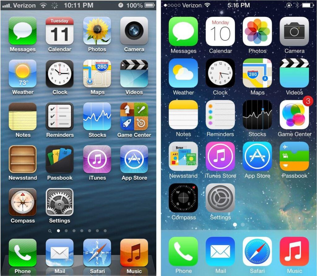
- Apple’s iOS 7: This redesign of Apple’s mobile operating system uses minimalism to create a modern and sleek user interface.

- Microsoft’s Metro Design Language: This design language uses flat colors and simple shapes to create an efficient and intuitive user interface.
Experience- A Ranking Factor!
The main aim of a UI/UX design is to create satisfying digital experiences. Now, it has become more important than ever, courtesy of the December Google algorithm update. Google adds Experience to the older E-A-T (Expertise, Authoritativeness, and Trustworthiness), making UX an inevitable ranking factor. A less is more approach is the simplest and most effective way to ensure great UI/UX and rank higher on SERPs.
Wrapping Up!
A minimalistic approach to UI/UX design aids in designing intuitive and interactive platforms that can load faster and rank better. The less is more approach is to the point and jumps straight to your user’s needs. Thus, eliminating unresponsive, sparingly visited/clicked elements and unnecessary features can improve your conversion rate. If you are looking for a professional UI UX designer book a consultation with our experts.


Rohan Kar - Content Writer
Latest posts by Rohan Kar - Content Writer (see all)
UI vs UX Design: Similarities And Differences
User-Generated Content for SEO: The Cost-Benefit Analysis You Need