 Lifecycle marketing
 Customer data management
 Email campaign production
 Search marketing
 CMS development
 Who we are
 How we work
 Case studies
 Testimonials
 Work samples
 Salesforce Marketing Cloud
 Braze
Braze HubSpot
 Marketo
 Pardot
 DataBricks
 Snowflake
 HighTouch
 RudderStack
 Segment by Twilio

Google now prioritizes mobile-friendly websites. This rise in mobile-first indexing is not just a passing trend but a seismic shift in the digital landscape. So, if you don’t prepare your lamp during the day, you will be left stranded in the dark at night. In other words, if you don’t take advantage of this, you might be lost in a mobile wilderness surrounded by frustrated users and low search rankings.
But do not tremble just yet. We are here to guide you through this treacherous road and help you optimize your website for mobile devices. After reading this article, you will become a pro and charm your audience with a seamless user experience and lightning-fast loading speeds.
So, please put on your safari hat, grab your smartphone, and let’s hit the road.
How has Mobile First Indexing Shown a Meteoric Rise?
Smartphones and tablets have become ubiquitous today, with millions of people using them daily to surf the web. Google’s mobile-first indexing is a response to the growing popularity of mobile devices and is designed to give higher search engine ranks to mobile-friendly websites. Besides this, here are more reasons why mobile-first indexing can be vital for your business.
- Visitors are five times more likely to abandon your site if it isn’t optimized for mobile devices.
- More than 50% of the searches on google.com come from mobile devices.
- Several advertisers rely heavily on mobile device users for traffic.
Let’s discuss them to learn how significantly they can impact your business.
Importance of Mobile First Indexing
Better search engine results and more mobile visitors are possible after you’ve optimized your site for mobile devices. Nevertheless, knowing where to begin can be difficult because there are so many moving parts, such as responsive design and mobile-friendly content.
Statistics on the Rise of Mobile Device Usage
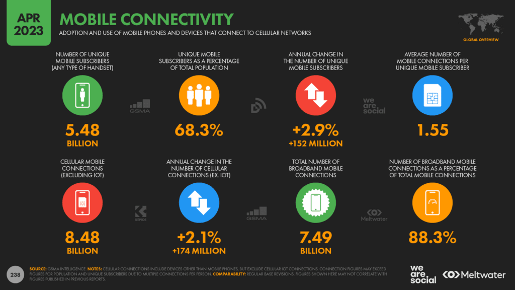
The proliferation of mobile phone use over the past decade has skyrocketed. There are more than 6.66 billion smartphone users worldwide as of 2022, as per data by Ericsson. That’s almost 4 in every five users. In addition, many people now rely only on their mobile devices to connect to the internet since they are both convenient and inexpensive. Smartphone and tablet use will continue to rise. And with 5G rolling, the expectation is that there will be over 5 billion 5G users by 2028. Therefore you should adjust your online strategies accordingly without wasting any time.
How Mobile-First Indexing Affects Search Rankings
Websites not optimized for mobile devices may see a drop in their search engine ranks, leading to a decrease in visitors and, ultimately, revenue. This is because Google’s ranking algorithm now greatly emphasizes mobile users’ experience. Most internet users today access the web through mobile devices, making it more crucial than ever to have a mobile-friendly website to ensure your business is seen in search results.
How to Make Websites Mobile Friendly?
Think of yourself as a potential customer, and open your website on your mobile device. Then ask these questions:
- Does your site load quickly?
- Is it easy to navigate?
- Is it easy to take action?
I am sure you have your answer by now. There is a lot of competition out there. If you don’t take heed of the latest trends, it will get challenging for you to garner attention.
Responsive Design and Mobile Friendly Websites
Websites that are easy to use on mobile devices and include a responsive design are essential for reaching mobile users. Thanks to responsive design, your website may look great and perform flawlessly on all devices. A mobile-friendly website is optimized for use on mobile devices, such as smartphones and tablets. Users may become frustrated and decide to go elsewhere if they cannot easily navigate your site using a mobile device.
Here is what you should do to gain a competitive advantage:
- Use a responsive design framework
- Use fluid grid layouts
- Optimize images and media
- Use responsive typography
- Test your website on multiple devices
- Avoid the use of popups
- Have a mobile-first approach
Mobile First Content and User Experience
Creating content and a user interface, especially for mobile devices, is also essential for mobile optimization. To accommodate mobile visitors, the text on your site should be broken up into short, digestible pieces. The mobile user experience is significant. Clear calls to action, simple navigation, and a quick checkout process are also crucial.
Image Optimization for Mobile Devices
Websites with images that take too long to load can cause visitors to be frustrated and bounce. Compressed picture files that maintain image quality while lowering file size are ideal for mobile device optimization. This guarantees a positive mobile user experience by reducing the time it takes for your website to launch.
Site Speed Optimization
Smartphone customers have come to anticipate instantaneous page loads. Haven’t we gotten used to it? On top of that, our attention span has crashed all sorts of norms. Our attention span is now one less than a goldfish’s 9 seconds. So, if your site is slow to load, people may never return. In addition, Google’s search algorithm takes page load time into account. Thus sites that load quickly tend to perform better in organic search results.
Local SEO for Mobile Devices
Local search engine optimization (SEO) helps your company appear in relevant mobile search results where many customers are looking for businesses. You must create local company listings on platforms like Google My Business and optimize your website for local keywords and phrases. By following these guidelines, you can enhance the mobile browsing experience for your site visitors.
Strategies to Improve Mobile First Indexing
Implementing Structured Data Markup
Using structured data markup on your website aids search engines in indexing your content. It enhances the visual appeal of search engine rankings pages (SERPs). You may boost your search engine rankings by using structured data markup to assist Google in better understanding your site’s content, such as your contact information and product descriptions.
Utilizing Google’s Mobile-Friendly Test
You can use Google’s Mobile-Friendly Test tool to see how well your site displays and functions on mobile devices and fix any problems you find. With the results of the Mobile-Friendly Test, you may get advice on how to make your site more accessible on mobile devices.
Monitoring Google Search Console for Mobile Issues
Improving mobile-first indexing also requires monitoring Google Search Console for mobile difficulties. For example, crawl errors and usability problems specific to mobile devices can be identified and fixed with the help of Google Search Console. In addition, the mobile performance of your website can be improved through constant monitoring of Google Search Console.
Conducting Regular Mobile Usability Testing
If you want to know if there are any problems with your website’s performance on mobile devices, you should conduct regular mobile usability testing. Checking your website’s functionality and user-friendliness on various mobile devices is essential to this process. You can ensure your website is mobile-friendly and offers a seamless user experience by performing regular mobile usability tests.
Future of Mobile-First Indexing
Anticipated Changes in Mobile First Indexing
The field of mobile-first indexing is a promising one with a bright future. With the introduction of mobile-first indexing, Google is expected to prefer websites that load rapidly on mobile devices. There may also be an increased priority placed on mobile-first design, with search engine rankings favoring mobile-friendly websites. There is also an emphasis on the increased use of voice search.
Key Takeaways
To sum up, mobile-first indexing is essential. A mobile-first approach has already been incorporated into our lifestyles. Mobile optimization is becoming increasingly important for online success as mobile device usage continues to climb. Businesses can optimize their websites for mobile devices and enhance their search rankings using the practices suggested in this article. Since mobile-first indexing is only expected to increase in popularity and sophistication in the future, it is essential for companies always to be one step ahead of the competition. If you need help with website optimization or SEO services contact Mavlers.