You know, when you walk into a store, and before you’ve even adjusted to the lighting, someone leaps at you with, “Hi ma’am! Can I help you find something today?”
And your brain immediately goes, I would simply like some oxygen first, please.
That, unfortunately, is the spiritual equivalent of most e-commerce popups.
They’re not bad because they’re popups; on the contrary, they are less than welcome because they behave like overeager sales interns with boundary issues.
And that’s a shame, because when popups are done right, they quietly become one of the highest-ROI elements in the entire lifecycle stack.
Interestingly, Klaviyo itself recommends a ~3%+ submit rate for popups and highlights multi-form strategies as a best practice.
Popups work because they meet people at the exact moment of buying curiosity, if executed with a bit of empathy and a lot of intention.
So let’s walk through, calmly, kindly, strategically, how to create a popup that people actually want to join.
No jump scares, desperation, or that needy “PLEASE SUBSCRIBE” energy.
Just clean psychology, thoughtful design, and a welcome experience that feels like a warm introduction rather than a needy plea.
Understanding why people sign up (And why they don’t!)
Well, you can think of a popup as a conversation starter. People don’t start conversations unless something piques their interest.
They sign up because the popup answers a problem they are thinking about subconsciously:
Is this relevant to me?
Is the value worth exchanging my email for?
Will this brand respect my inbox, or will they text me motivational quotes at 7 AM?
A high-converting popup resolves these fears immediately and offers something that feels meaningful in the moment.
While a low-converting popup, usually says something vague like “Sign up for our newsletter.”
Which is essentially marketer-speak for “Please give us something valuable in exchange for nothing specific.”
Popups convert when they are clear, helpful, low-friction, and timed like they were created by someone who respects human attention.
Fortunately, all of that is fixable.
Pick a popup format that matches how people shop
While Klaviyo gives you formats, it’s important to note that formats aren’t about aesthetics; they’re about behavioral fit. Let’s unpack them.
The classic discount popup
If your store sells apparel, home goods, lifestyle products, beauty, wellness, basically anything with impulse-friendly price points, a simple “Get 10% off” still outperforms most fancy tactics.
It’s reliable, much like comfort food for e-commerce.
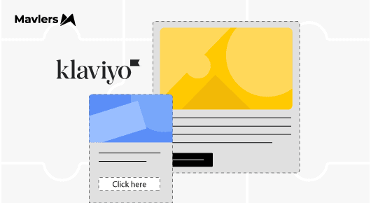
The multi-step popup (the unsung hero)
This format works because it lowers the barrier:
First, a gentle yes (“Unlock your offer”), then the email, then, if appropriate, the phone number.
Klaviyo’s own data consistently shows multi-step forms increasing conversion rates
by double digits because they create momentum. You’re not asking for everything upfront; you’re easing people in.
Quiz-style popups
These shine when your product requires education, such as skincare, mattresses, supplements, and tech accessories. People don’t want discounts here; they want clarity.
When a popup helps someone decide, they happily exchange information.
Non-discount value popups
For premium or margin-sensitive brands, early access or exclusive membership works beautifully. Basically, you’re inviting them into a club, not giving away money.
Irrespective of the format you choose, the rule is simple, the popup should feel like it belongs to your brand’s personality, not the default template graveyard.
Your offer sets the ceiling for your conversion rate
Honestly, a popup is only as good as the promise it makes, and no amount of elegant design can rescue a weak offer.
“Sign up for our newsletter” is not an offer; it’s an emotional burden.
A good offer feels like something someone would naturally say yes to, even if they weren’t hunting for a discount.
For instance, a small flat ₹ amount (“Get ₹250 off your first order”) feels instantly tangible.
“Unlock early access to drops” appeals to FOMO-driven categories such as fashion, eco-luxe, or limited-edition batches.
“Find your perfect skincare routine ~ discount inside” works wonderfully for beauty brands where guidance matters.
The offer should make the visitor think, “Well, I am curious enough, so why not?”
Write popup copy that feels human (But converts like a machine)
If the popup were an in-store interaction, the copy would reflect the salesperson’s tone of voice.
Warm, friendly, quick to the point, definitely not robotic or overly pushy.
Let your headline do one job, which is to deliver the value clearly. Try something like “Unlock 10% Off,” “Your Welcome Gift Awaits,” or “Get Early Access.”
Then use the subtext to explain the benefit in one sentence.
This is where you reassure, clarify, and add charm without clutter.
And please, for the sweet love of conversion, the CTA cannot be “Submit.”
No human being gets excited by submitting anything except assignments under duress.
Instead, you could try something along the lines of “Send My Code”, “Reveal My Offer”, “Help Me Choose,” or plain & simple “Get Started.”
These small shifts make a popup feel conversational instead of transactional.
Make the design look like it belongs to the brand
Most popups look disconnected from the store they’re on, you know, colors that are not brand-conforming, wrong typography, wrong vibe.
Design doesn’t need to be fancy, it just needs to be familiar.
Visitors should feel visually connected to the brand and say, “Yes, this is still the same brand I was just browsing.”
Keep the layout spacious. Try to use one strong visual, if needed, and make sure the mobile version isn’t a cramped afterthought, because most traffic deserves better.
And do not underestimate the humble teaser button that appears after someone closes the form, as it quietly brings back a chunk of visitors who changed their mind.
Yep, a small feature can have a big impact!
Optimized timing & targeting
A popup shouldn’t appear the moment someone lands, it’s like offering dessert before they’ve sat down.
Give them five to eight seconds, or trigger it after they’ve scrolled a bit. The key is to let them settle in.
Also, and this is one of the most common oversights, exclude your existing subscribers.
Klaviyo literally makes this a one-click rule.
There’s no justification for annoying the people who already trust you.
Desktop gets exit-intent, mobile gets simpler layouts, and everyone gets a calmer experience.
Pretty chill, we say!
Multi-step popups
The genius of a multi-step popup lies in the first step, as it asks for nothing, just a click.
That click is commitment, and once someone clicks “Unlock Offer,” their brain shifts from observer to participant.
This is why multi-step forms lead to more data, more qualified subscribers, and smoother welcome flows.
It’s not fancy, it’s just good ol’ psychology.
Don’t neglect the welcome flow!
While a popup is the invitation, the welcome flow is the conversation that follows.
If your welcome email arrives late, looks like it was written by legal, or doesn’t deliver the incentive promptly, you will hemorrhage conversions.
A strong welcome flow should give the code immediately, introduce the brand without lecturing, show people what others love, and remind them gently about the offer expiry.
It’s akin to hosting someone who just walked into your home, warm, concise, helpful, and genuinely not overbearing.
Put to the test the things that matter!
When you’re optimizing a popup, test the variables that move the needle, you know stuff like;
Is the offer attractive?
Is the headline clear?
Does the multi-step version outperform the single step?
Does showing it 5 seconds later improve signups?
Does the teaser lift conversions?
These are the kinds of tests that compound into significant list growth. Changing the background from peach to pastel green, well, usually does not.
Highlighting the usual popup mistakes that you should avoid
Every underperforming popup I’ve ever audited falls into one of these buckets:
Asking for too much too early
Delivering the code late
Showing to people already subscribed
Triggering instantly
Using hollow copy
Breaking on mobile
Forgetting the teaser
Offering something vague
Fixing these feels like tightening the screws on an already working machine; things just start running smoother.
The road ahead
So, to sum up, the real job of a high-converting Klaviyo popup is not to beg, not to bribe, but to bridge the moment between curiosity and commitment. On that note, were you aware of Klaviyo’s auto monitors? In case you would like to know more, consider reading ~ Klaviyo Auto-Monitors: A Preliminary Overview.