
Anticipating and going beyond our clients’ project briefs is what sets us apart.
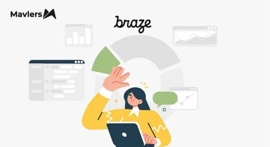
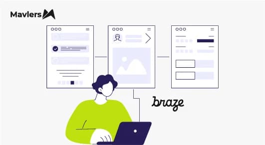
Following this vision, last month, our team launched, among other things, Braze’s in-app messaging as a service. We wanted to share how we’re advancing with Braze’s in-app messaging, including encountering challenges and resolving them.
Speaking generally, in-app messaging boasts a 75% impression rate. That’s a mind-blowing 45 times higher than email. 3 times higher than push notifications, too.
In-app messaging is targeted, contextual, and up-front. In Braze, we’ve leveraged modals (basic and advanced) and full-screen messaging so far.
We’ll get to both, but first, let’s quickly catch up on the benefits of in-app messaging, and why you should add it to your marketing playbook.
- Benefits of in-app messaging
- Full-screen messaging
- Modals in Braze
- Challenges while implementing modals
Benefits of in-app messaging
Here are some of the benefits of in-app messaging:
- Enhanced User Engagement: Personalized, timely messages boost user interaction and retention, guiding users through key actions and features within the app.
- Improved User Experience: Seamless integration with the app’s interface ensures a smooth experience, while relevant messaging minimizes the risk of users feeling spammed or overwhelmed.
- Higher Conversion Rates: Targeted messaging drives higher conversion rates for promotions, updates, and calls to action, while effective onboarding and re-engagement strategies enhance overall app performance.
- Data-Driven Decisions: A/B testing and detailed analytics provide valuable insights, enabling continuous improvement and optimization. A data-driven approach allows for the continuous refinement of messaging strategies over time, ensuring effectiveness and relevance.
- Brand Consistency: Customizable templates maintain alignment with brand guidelines, ensuring consistent messaging across all channels and touchpoints.
- Operational Efficiency: Pre-built templates and an intuitive interface save time and resources, while automated triggers and scheduling minimize the need for manual intervention.
Full-screen messaging
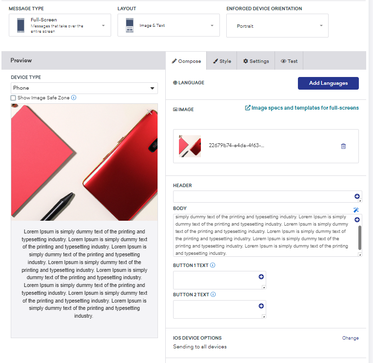
Full-screen messaging is where the message takes up the whole screen. If the notification is urgent and demands immediate attention, a full-screen message is very useful. Below is an example of a full-screen notification in Braze on mobile.
Full-screen messaging offers the following benefits:
- Improved visibility: A full-screen message is unmissable. But which is also why it should be used only when needed. Leverage it for important, urgent messages.
- Strong call to action: The available real estate allows you to feature a strong, prominent call to action, encouraging the user to act immediately.
- Immersive experience: Occupying the entire screen, these messages create an immersive experience, deepening the viewer’s focus. Depending on how you design these messages, it can foster positive brand perception and improve UX.
- Great for critical information: You may use full-screen messaging to highlight time-sensitive offers — but, keep it few and far between.
Modals in Braze
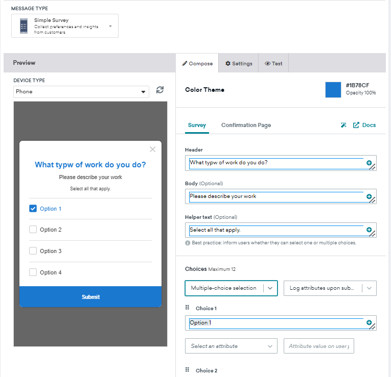
Modals show up in the center of the app’s screen. The below image, for example, shows a survey modal in Braze.
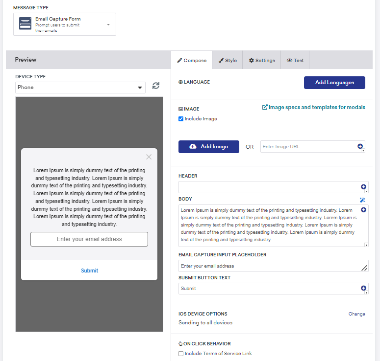
Here is another example of an email capture form modal in Braze.
Challenges while implementing modals and resolutions
We faced a number of challenges working with modals in Braze. Here are some of them.
Challenge 1
We encountered height issues with multiple slides in Braze’s In-App messaging, as each slide had different heights, making it difficult to standardize the height across all slides.
Resolution: We removed the height property from the main class to address height issues, and adjusted the content positioning to ensure compatibility across all devices.
<!-- Slider controls -->
<div class="slider-control">
    <div class="slider-control-wrapper">
        <img src="./images/arrow-left.svg" alt="slider-arrow" class="arrow" data-slider-arrow="prev">
        <div class="dots-wrapper" data-slick-slider="bread-crumbs-box">
        </div>
        <img src="./images/arrow-right.svg" alt="slider-arrow" class="arrow" data-slider-arrow="next">
    </div>
    <div class="data-wrapper">
        <button data-btn-type="close-popup" class="secondary-action">Secondary action</button>
        <button class="primary-action" data-btn-type="primary-action">Primary action</button>
    </div>
</div>
Challenge 2
After displaying the last slide and triggering the final on-click behavior button, the In-App message was supposed to close automatically, but we encountered an issue preventing this from happening.
Resolution: We implemented a separate JavaScript function [lastButtonListener()] to resolve the closing issue after the final on-click behavior CTA. This JavaScript function manages button behavior within a slider component, making actions like closing a pop-up possible. Here’s the code.
lastButtonListener() {
    const ctaArray = this.$sliderParent[0].querySelectorAll("[btn-type]");
    if (ctaArray.length > 0) {
        ctaArray.forEach(eta => {
            const btnType = eta.getAttribute("btn-type"); // corrected variable name
            eta.addEventListener("click", () => {
                if (btnType === "close-popup") { // added comparison operator
                    this.$sliderParent[0].parentElement.style.display = "none"; // fixed variable name
                }
                if (btnType === "primary-action") { // added comparison operator
                    // const getCurrentSlide = $(this.sliderControl).slick("slickCurrentSlide"); // Uncomment if needed
                    const slideLength = this.sliderControl[0].slick.$slides.length; // fixed indexing
                    // if (getCurrentSlide === slideLength - 1) { // Uncomment if needed
                    window.open('https://www.google.co.in/', '_blank');
                    this.$sliderParent[0].parentElement.style.display = "none"; // fixed variable name
                    // } else {
                    //     $(this.sliderControl).slick("slickNext"); // Uncomment if needed
                    // }
                }
            });
        });
    }
}
Challenge 3:
We could only apply different media queries for various mobile clients when the modal’s position was based on height.
Resolution: We utilized advanced CSS (such as default styles, responsive design principles, CSS variables, and custom scrollbar styling) to maintain the in-app structure across various mobile clients.
/* Default styles */
up-in-app .slick-dots .slick-active button {
    background: rgba(16, 16, 5, 0.11); /* Assuming 0.11 is the intended alpha value */
    width: 32px;
    border-radius: 32px;
}

/* Responsive styling */
@media screen and (max-width: 767px) {
    up-in-app .popup-overlay {
        align-items: flex-end;
    }
}

:root {
    --slide-bg-color: max-width: 100vw; /* This line needs clarification */
}

up-in-app .popup-slider-container {
    border-radius: 16px;
    border-bottom-left-radius: 0px;
    border-bottom-right-radius: 0px;
    background-color: var(--slide-bg-color); /* Assuming you want to use the variable here */
}

up-in-app .popup-slide {
    border-radius: 0;
    padding: 60px 16px 32px 16px;
    max-width: 100vw;
}

up-in-app .popup-slide .popup-btn-top {
    max-height: 120px;
    overflow-y: scroll;
}

up-in-app .popup-slide .popup-btn-top::-webkit-scrollbar {
    width: 2px;
}

up-in-app .popup-slide .popup-btn-top::-webkit-scrollbar-track {
    border-radius: 20px;
    background: rgb(255, 255, 255);
}
Need help with Braze?
If you are already using Braze at your agency, feel free to share your project briefs with our certified Braze experts. Our six-tier email marketing framework is tried and tested for all your email needs.
For more information related to Braze, check out how to improve customer engagement with Braze’s Sage AI.