Custom HubSpot solutions on your mind? We got you covered. Visit Mavlers
- Getting Started
How to Create a Page Using a theme?
- Landing Pages- In your HubSpot account, navigate to Marketing > Landing Pages.
- Website Pages- In your HubSpot account, navigate to Marketing > Website > Website Pages.
- Hover over a page and click Edit.
- Click the File menu and select Page settings. and enter an internal name in the Internal page name field.
- In the Page title field, enter an external name for the page. This name will appear in the tab at the top of a visitor's web browser when the page loads.
- Within the "Page URL" section, open the Domains dropdown menu and pick the appropriate domain under which your page will be accessible. Subsequently, input a URL slug into the Content slug field.
- Within the Meta description field, input a description detailing the content of the page. This description will be visible in search results just below the page title.
- Access the page settings by clicking on them. If you wish to opt for an alternative template, select the option labeled "Use different template." When altering the template of an already published page, ensure you click "Update" and subsequently "Update now" to make any pending edits live. This step is crucial to prevent potential loss of changes when transitioning between templates.
- To publish the page, follow these steps:
- Click on "Publish" located in the upper right corner.
- In the dialog box that appears, select "Publish now" to proceed.
Introduction
In the theme settings, you can change the-
- Global Colors
- Global Fonts
- Layout
- Typography
- Button
- Forms
- Tables
- Website Header
- Website Footer
Global Colors
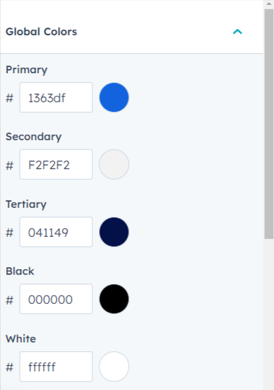
When you're customizing your website's design, you have the option to adjust different types of colors: Primary, Secondary, and Tertiary.By adjusting these color categories, you have the opportunity to craft a cohesive color palette that aligns with your brand identity and creates a memorable visual experience for your visitors.
Global Fonts
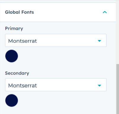
You have the ability to make changes to both the Primary Font and the Secondary Font. This means you can select different typefaces or font families for these two design elements, allowing you to establish a distinct typographic style throughout your website.
Layout
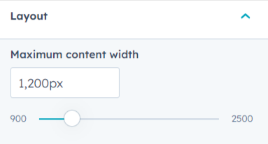
By modifying the "Maximum Content Width," you can control how wide the main content area, text, images, and other elements span across the screen.
Typography
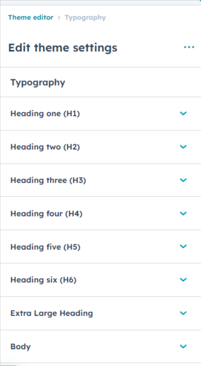
Certainly! Within the "Typography" customization options, you have the ability to make several font-related modifications to your website.
- Heading Fonts: You can adjust the font family, color, and style for various heading types such as h1, h2, h3, h4, h5, and h6. This allows you to define a consistent visual hierarchy in your content by making headlines more noticeable or stylish. You can opt for different fonts to match the tone of different sections of your site.
- Body Font: You also have the option to modify the font used for the main body text of your website. This is the font that appears in paragraphs, articles, and other main content areas. Choosing an appropriate body font contributes to readability and the overall look of your website.
- Anchor Links Font: Additionally, the "Typography" section often includes the ability to customize the font for anchor links. These are the hyperlinks that take users to specific sections of the same page. Modifying the anchor links font can help them stand out within your content.
These typography adjustments allow you to maintain visual consistency and align your website's appearance with your brand identity.
Button
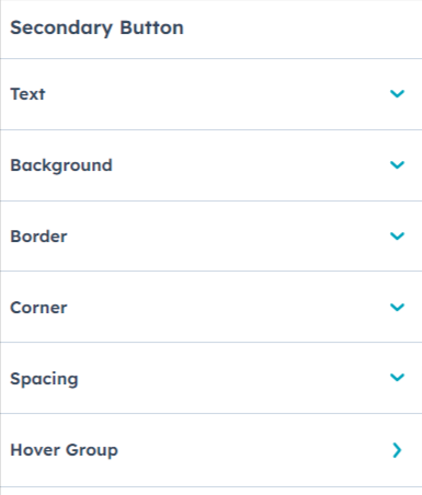
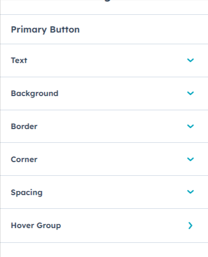
You have the flexibility to alter both the Primary Button and Secondary Button Style. Additionally, you're given the choice to adjust the button spacing, modify corner radius, and even customize the button's hover color.
Forms
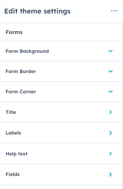
You have the capability to customize various aspects of the form, including the form title, background color, help text color, error message color, label color, field color, and fonts for each of these elements.
Tables
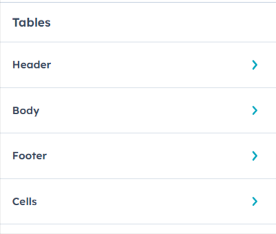
You have the capability to modify the fonts and colors for the table header, table footer, and table cells too.
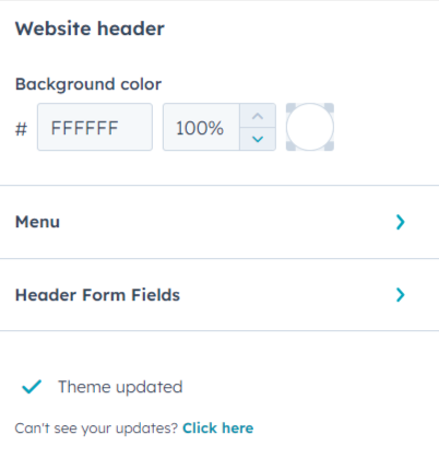
Website Header
You have the option to adjust the background color of the header, the font and color of the header menu, and the colors of the form fields within the Website header.
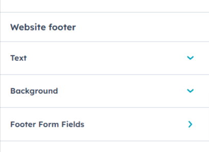
Website Footer
You have the flexibility to alter the background color of the footer, adjust the font and text color, and customize the colors of the form fields within the website footer.
Sections
Exanto HubSpot theme includes 7 reusable drag-and-drop sections listed below.
1. Contact
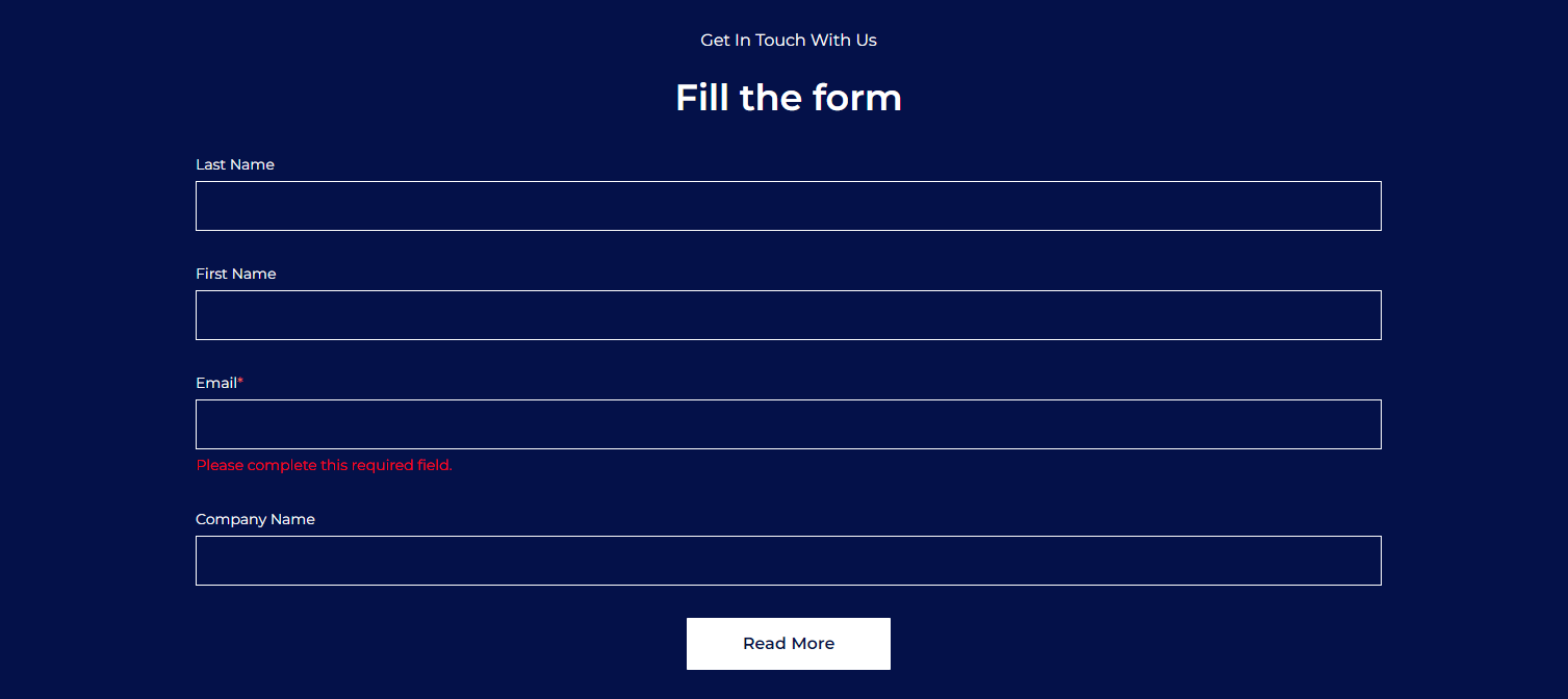
Certainly! The "Contact Section" offers you a range of customization options to effectively manage how the contact information is presented on your website.
Heading and Description: You have the ability to add a distinct heading and a description within the "Contact Section." The "Rich Text" area allows you to create visually appealing and formatted content. This content could include a catchy heading that draws attention to the contact information and a description that provides context or instructions.
Form Customization: The "Contact Section" also allows you to modify the contact form itself. This includes adjusting the fields within the form, changing the labels for each field, and potentially even adding or removing fields to tailor the form to your specific needs.
2. Content with Images
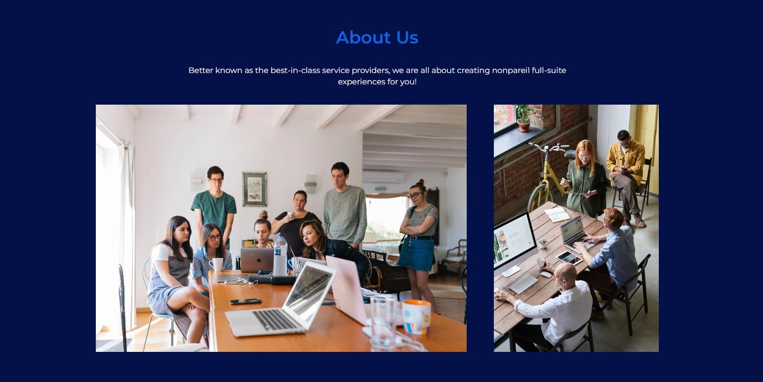
The Contact with Images Section has the ability to add the Heading and the Description in the Rich Text area. Additionally, you have the option to include images within the "Contact with Images Section." This could involve adding relevant images, such as product photos, or team pictures, to complement the contact information. These images can provide visual context and help make the contact section more engaging and informative.
3. Heading and Content
This section has has the ability to add the Heading and the Description in the Rich Text area.

4. Pricing
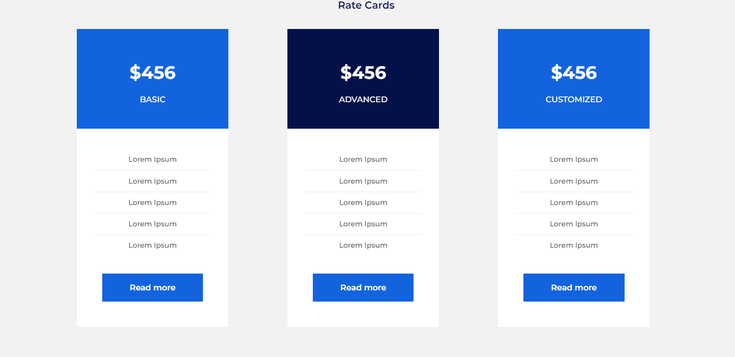
The "Pricing Section" is designed to effectively communicate the rate cards and plans available on your website. Middle centered heading above the three pricing cards, containing a subheading, description, and button each. Each card represents a different rate or plan that you're offering. These cards provide a clear visual presentation of your pricing options. Each pricing card is accompanied by a button.
5. Team
Four Column Team Image with Hovered Content which has the Team member name and the designation. Within each column, an image of the respective team member is displayed. When a user hovers their cursor over a team member's image, additional content becomes visible. This content typically includes two key pieces of information: the team member's name and their designation or role within the organization.

6. Testimonial Cards
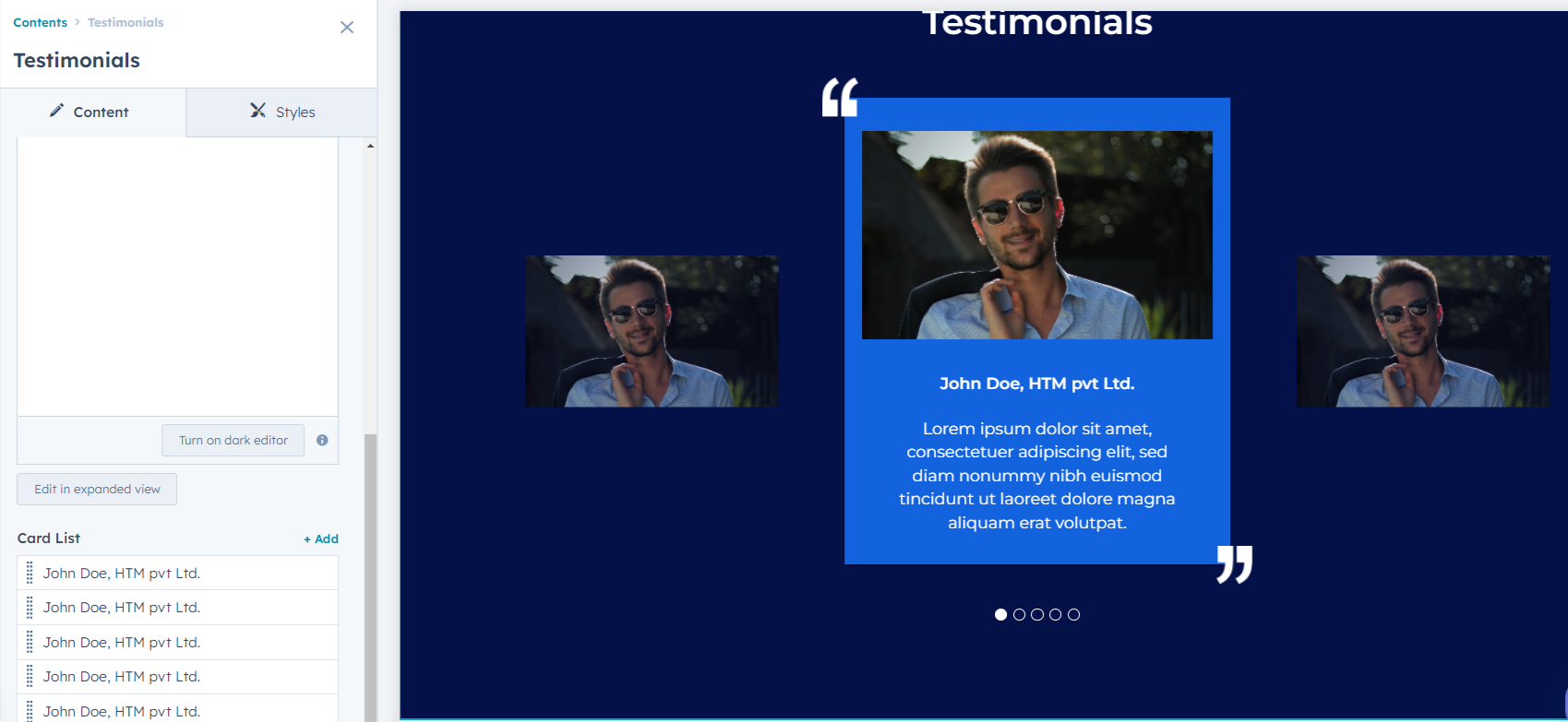
The "Testimonial Section" is a valuable component often used on websites to showcase positive feedback, reviews, or testimonials from customers or clients. In the "Testimonial Section," each testimonial is usually accompanied by a photograph of the individual providing the feedback. Alongside the individual's photograph, there is a written testimonial or feedback. This text typically contains positive comments, reviews, or endorsements about your product, service, or experience. Testimonials serve as social proof, influencing other visitors and potential customers.

7. Three Column Section
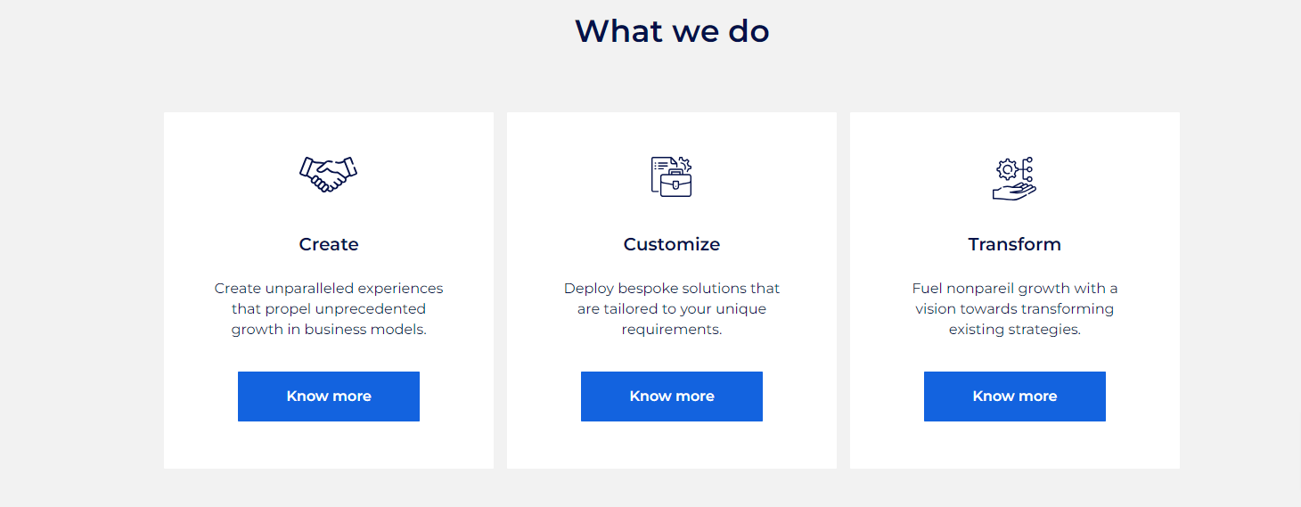
Three Column Section with Icon, Heading, Content, and the Button Text. The combination of icons, headings, content, and buttons creates a well-structured and informative section.
Templates
The "Exanto HubSpot Theme" encompasses a comprehensive collection of 22 different templates, each designed to serve specific purposes and cater to various aspects of your website. Here's an elaboration of the templates included:
- Home Page
- About
- Services
- Team
- Contact Us
- Blog Listing
- Blog Detail
- FAQ
- Testimonial
- Case Studies Listing
- Case Studies Detail
- Vision Mission
- Clients
- Pillar
- Videos
- Portfolio
- Awards
- Timeline
- Pricing
- Thank you
- Landing Page
- Events
Each template is designed to fulfill specific objectives and enhance the user experience on your website. The variety of templates in the "Exanto HubSpot Theme" allows you to create a well-rounded and dynamic online presence, catering to different aspects of your brand, products, and interactions with your audience.
Modules
These modules includes the combinations of text, images, buttons, forms, and other elements. Th has Drag-and-Drop Functionality,Customization and the Responsive Design
A few modules from the "Exanto Theme":
Logo Module
A "logo slider" is a dynamic element commonly used on websites to showcase multiple logos in a slideshow format. It's particularly useful for displaying a collection of partner logos, client logos, or affiliations in an interactive and visually appealing manner.
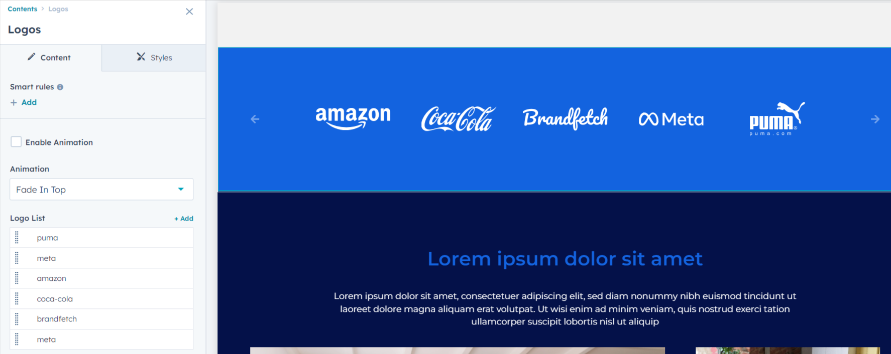
A well-designed logo slider is responsive, adapting to different screen sizes and devices. This ensures that the logos remain legible and visually appealing across desktops, tablets, and mobile devices.
Testimonial Module
It provides an engaging and visually appealing way to highlight positive experiences and comments from clients or customers.
Team Module
Users can upload an image of their choice or select from available options. This image can be replaced with a different image that aligns with the content's context. Additionally, users have the option to remove the image if it's not needed. It includes the ability to adjust the width and height of the Image.
.webp)
Button Module
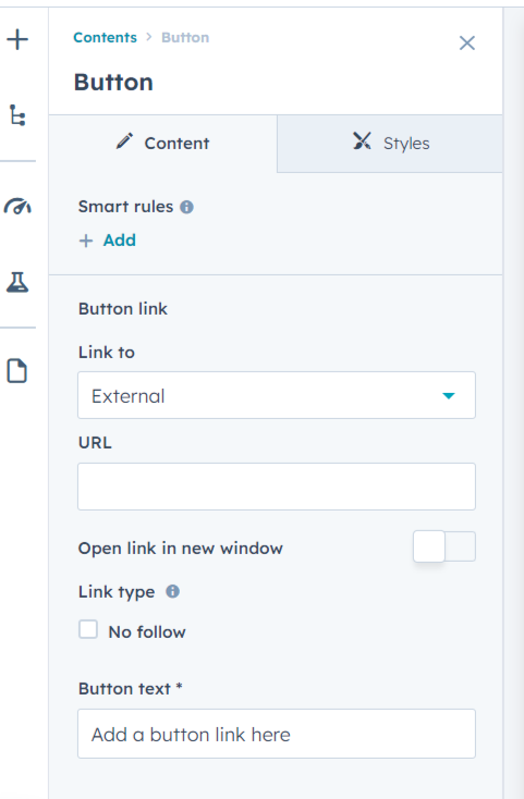
This module is a simple yet versatile component that allows you to add interactive buttons to your web page.
Banner Module
The "Hero Module" is a prominent and visually impactful content section often placed at the top of a web page. It's designed to instantly capture visitors' attention and convey important information. It has the ability to edit the Background Color, Background Image, Overlay, Text Content, Button, Styling Options, Layout and Alignment. You can also customize the font styles, text colors, and button styles to align with your brand's design guidelines.

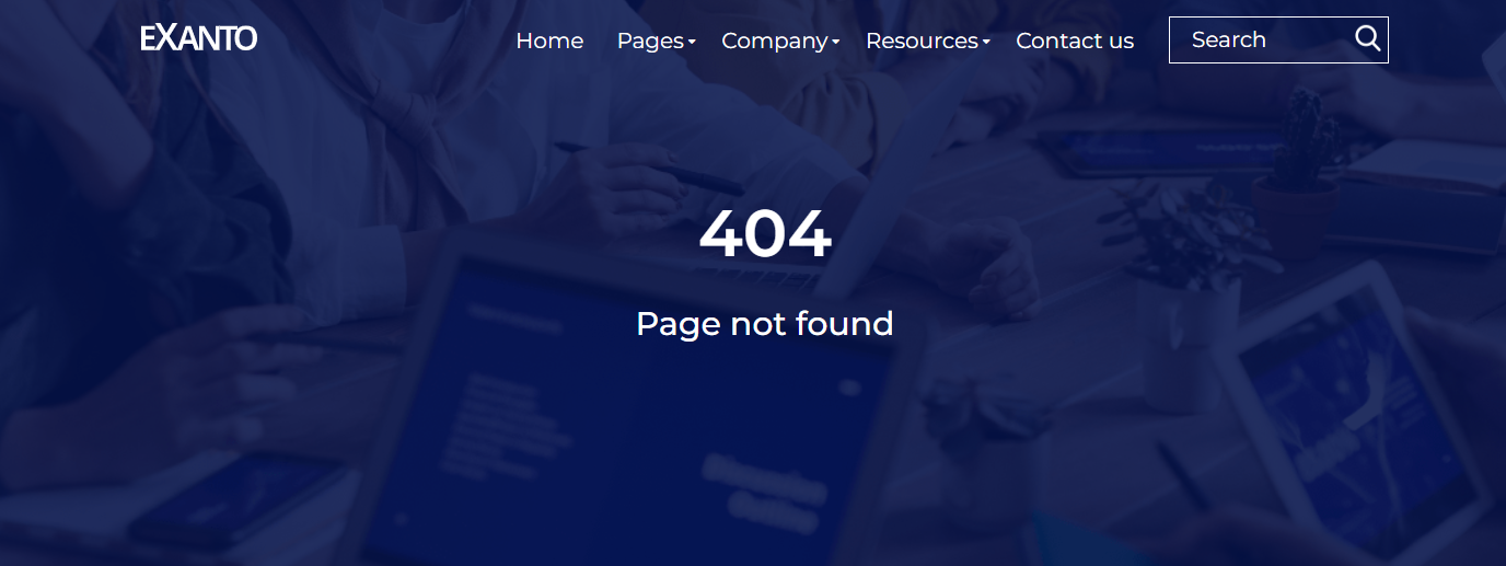
Error Page 404
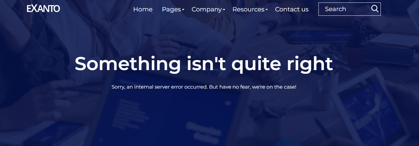
Error Page 500
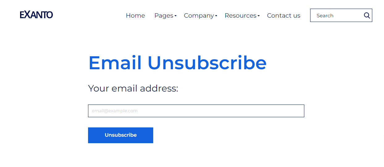
Backup Unsubscribe Page
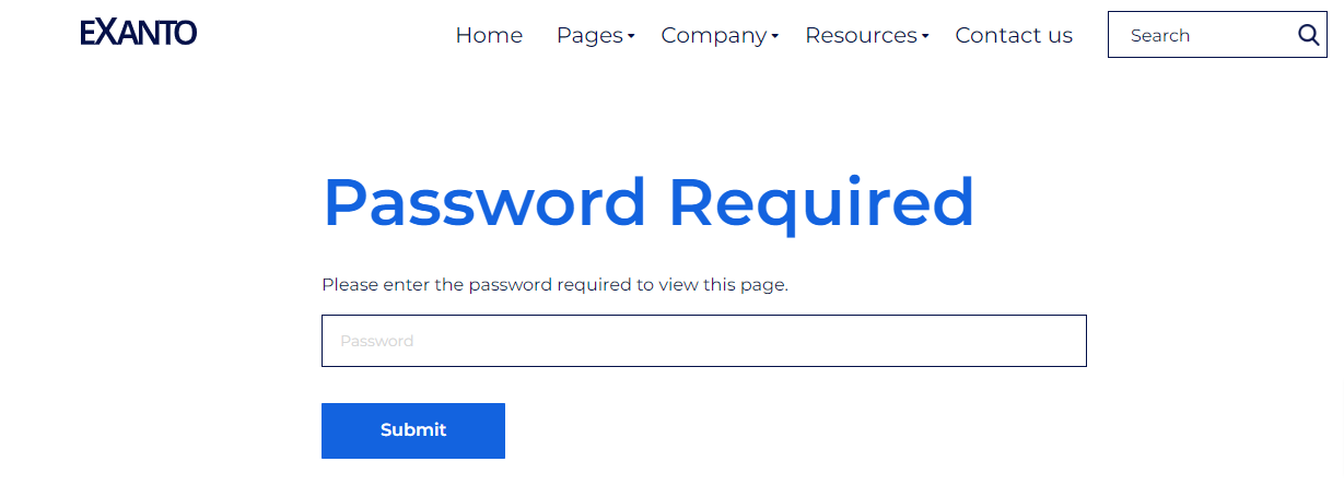
Password Prompt Page
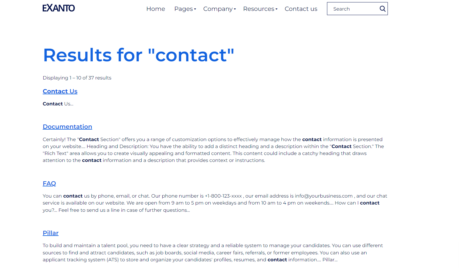
Search Result Page
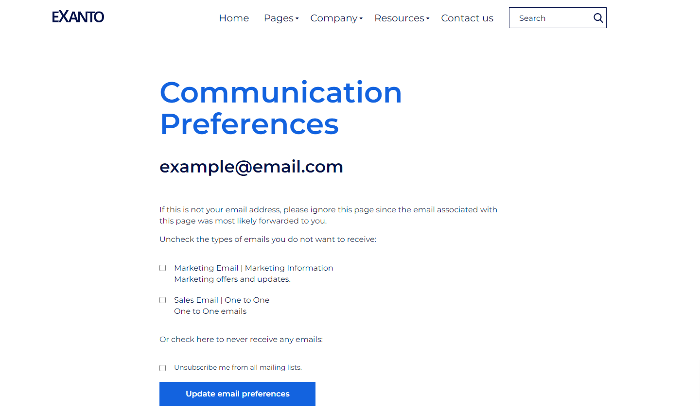
Subscription Preferences Page
Subscription Confirmation Page

FREQUENTLY ASKED QUESTIONS
No, our theme is absolutely free of cost.
Yes, the theme can be applied across every domain you possess.
No prior coding experience to modify any elements on the theme. You just have to access theme settings to make any changes you want.
We generally respond to all queries within 2-3 business days.
We offer 24x5 support in the areas of website development and maintenance concerns, dedicated resource onboarding queries as well as customer specific requirements.
GET IN TOUCH!
Having Queries With The Theme Or Any Other CMS Requirements?


